Operations wastage analysis
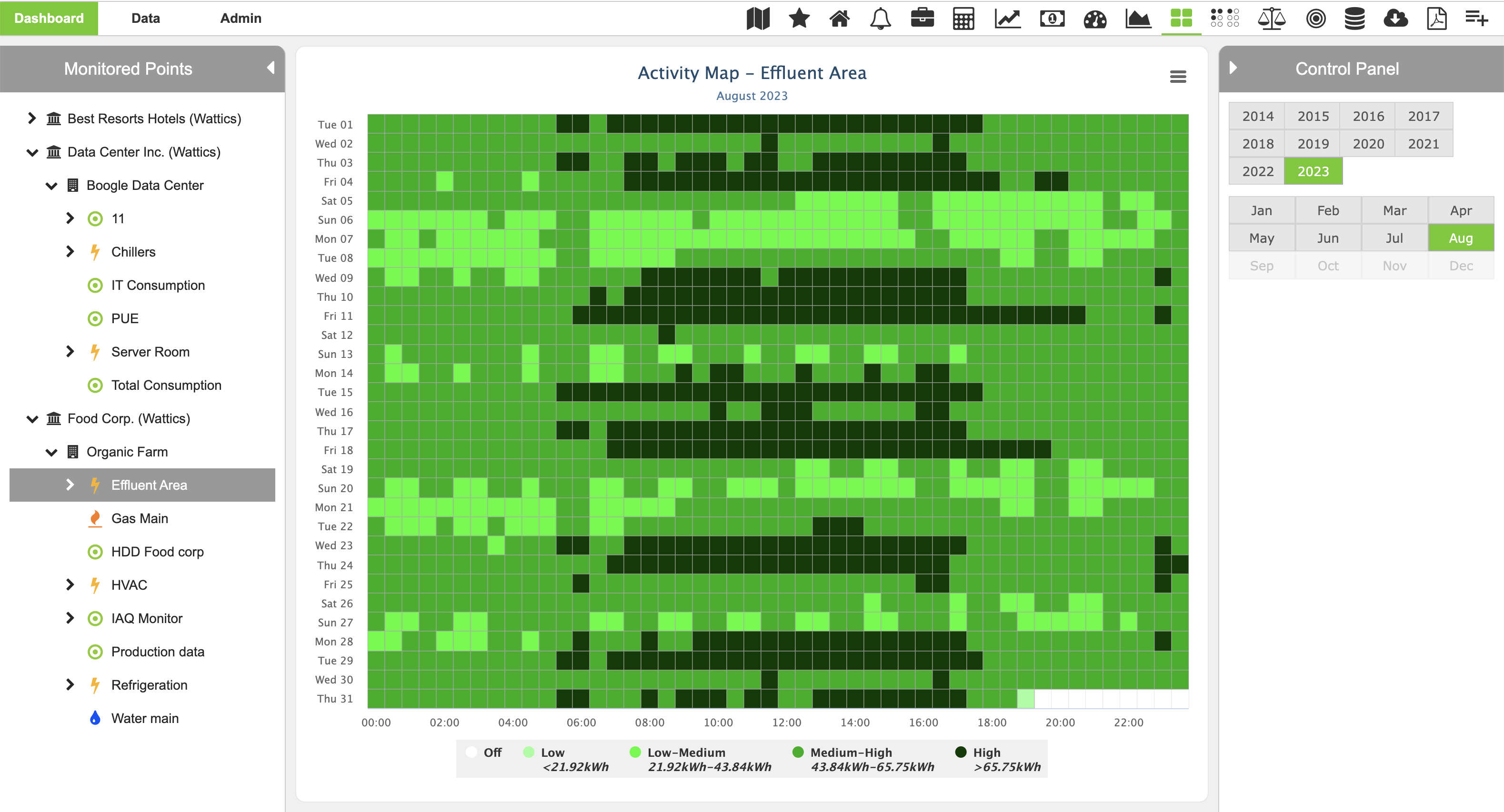
Activity Maps is a heatmap of the energy use for a selected data point and helps you identify savings opportunities at a glance, providing you with an intuitive overview of how good (or bad) you are doing with your energy use.
Activity Maps immediately show you when someone has forgotten to switch off the equipment after hours (dark green peak consumption overnight) and when some machines are never switched off and run 24/7 (light green color overnight should be white to indicate no consumption).
- Find the patterns of equipment behavior with heatmaps
- Set the schedule when to switch off a particular piece of equipment or group of appliances
- Estimate savings based on historical data

 Best-in-class portfolio-level energy and utility bill data management and reporting.
 Real-time energy and sustainability analytics for high-performance, net-zero buildings.
 A holistic view of financial-grade scope 1, 2, and 3 carbon emissions data across your entire business.
 Energy and sustainability benchmarking compliance software designed for utilities.
