Weather data
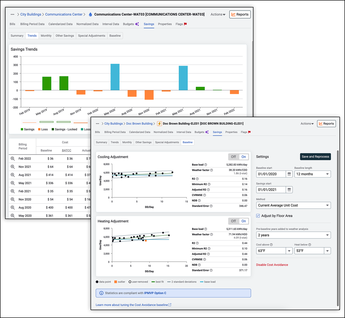
Use vs. Weather graphs in EnergyCAP UtilityManagement reveal correlations between the two variables. By comparing monthly degree days with meter energy use, it is possible to determine if the meter is weather-sensitive. How does EnergyCAP UtilityManagement know when a meter is weather-sensitive? A linear regression analysis is used to model the effect of degree days on energy use reported on each bill.
On Use vs. Weather charts, the vertical axis is the average daily use, and the horizontal axis is the average number of heating or cooling degree days per day. If the regression line rises from left to right, it means that months with more degree days have more use, suggesting that at least a portion of the energy usage is weather sensitive.

 Best-in-class portfolio-level energy and utility bill data management and reporting.
 Real-time energy and sustainability analytics for high-performance, net-zero buildings.
 A holistic view of financial-grade scope 1, 2, and 3 carbon emissions data across your entire business.
 Energy and sustainability benchmarking compliance software designed for utilities.
